
In the vast digital landscape where websites and applications vie for user attention, the role of user interface (UI) design cannot be overstated. Every pixel, font, and button placement plays a crucial part in shaping the user experience. Among the myriad elements that designers consider, color stands out as a powerful tool that not only enhances aesthetics but also influences user behavior and perception. Welcome to the colorful world of Color Psychology in User Interface Design!
At its core, color psychology delves into the emotional and cognitive effects of colors on human behavior. From evoking feelings of tranquility to triggering urgency, colors possess the ability to communicate and connect with users on a subconscious level. In the realm of UI design, understanding this psychological interplay can significantly impact how users engage with digital products.
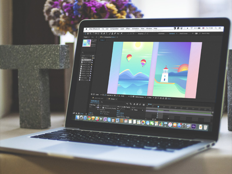
Imagine navigating through a website painted in vibrant hues of red and yellow. These warm colors can evoke feelings of excitement and urgency, urging users to take action promptly. Conversely, cooler tones like blue and green tend to instill a sense of calmness and trust, ideal for websites promoting security or healthcare services. By strategically incorporating these colors, designers can guide user interactions and influence decision-making processes.
One of the fundamental aspects of color psychology lies in the association between colors and emotions. For instance, red often symbolizes energy, passion, and urgency, making it a popular choice for ‘call-to-action’ buttons or notifications. On the other hand, green signifies growth, harmony, and safety, making it suitable for financial platforms or eco-friendly initiatives. By aligning color choices with the intended emotional response, designers can create immersive digital experiences that resonate with users.
Moreover, cultural and contextual factors play a pivotal role in interpreting colors. While white symbolizes purity and simplicity in Western cultures, it signifies mourning and loss in some Eastern cultures. Therefore, it’s essential for designers to conduct thorough research and consider the diverse cultural backgrounds of their target audience when selecting color palettes. By embracing cultural nuances, designers can foster inclusivity and ensure that their designs resonate across different demographics.

The strategic use of color not only influences user emotions but also facilitates intuitive navigation and information hierarchy. Through the judicious application of color contrast, designers can emphasize important elements and guide users’ attention towards key functionalities. For instance, using a bold color for headlines or buttons against a neutral background can enhance readability and promote user engagement. By leveraging color to create visual hierarchies, designers can streamline the user experience and enhance usability.
In addition to emotional resonance and visual hierarchy, color accessibility remains a critical consideration in UI design. With a growing emphasis on inclusivity and diversity, designers must ensure that color choices accommodate users with visual impairments or color deficiencies. By adhering to web accessibility standards such as WCAG (Web Content Accessibility Guidelines), designers can optimize color contrast ratios and provide alternative text for color-dependent information. Through accessible design practices, designers can enhance usability and ensure that digital products are inclusive for all users.
Furthermore, color consistency plays a vital role in establishing brand identity and fostering user recognition. By maintaining a cohesive color palette across different touchpoints, designers can strengthen brand associations and reinforce brand values. Whether it’s a logo, website, or mobile app, consistent use of colors creates a unified brand experience that resonates with users. Through brand-centric color schemes, designers can establish visual coherence and build trust with their audience.
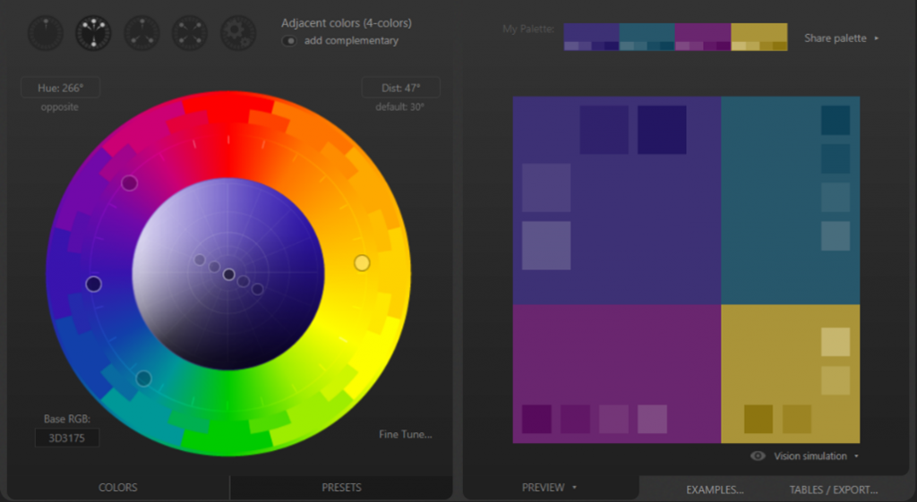
As technology evolves, the role of color psychology in UI design continues to evolve alongside it. With the emergence of dark mode interfaces and augmented reality experiences, designers have new opportunities to explore innovative color schemes and immersive visual environments. By harnessing the principles of color psychology, designers can create dynamic and engaging user experiences that leave a lasting impression.
In conclusion, the role of color psychology in user interface design extends far beyond mere aesthetics. By understanding the emotional, cultural, and cognitive impact of colors, designers can craft meaningful digital experiences that resonate with users on a subconscious level. From evoking emotions to guiding user interactions, colors serve as a powerful medium for communication and expression in the digital realm. As designers embrace the nuances of color psychology, they pave the way for more engaging, inclusive, and impactful user experiences in the ever-evolving landscape of UI design.